Multi brand design system
Web
Responsibility
Design & Maintain
Year
2024
Client
US Big Pharma
Designed a dynamic design system tailored for a multi-brand pharmaceutical company. This system unifies brand elements across different identities, balancing cohesion with the flexibility each brand requires to stand out. Through this approach, we enable consistent, scalable design across brands, empowering teams to enhance
key Statistics
A snapshot of the design system’s impact—highlighting ROI, documentation coverage, design acceleration, and development efficiency.
99%
Complete Documentation – Comprehensive component and usage documentation ensures a single source of truth for all teams.
45%
Estimated RoI in Year 1 –
High return driven by reduced redundancy, faster workflows, and lower maintenance costs.
43%
Faster Design Process –
Pre-built components and guidelines significantly sped up design workflows.
54%
Faster Development Process – Reusable code and design alignment halved front-end development time.
Timeline
6 Months
Tools
Figma, Jira, Microsoft Teams, Microsoft Excel
Team
2 members
Overview
The multi-brand design system project aimed to unify the web experience across distinct pharmaceutical brands, each with its own identity, audience, and regulatory needs. By creating a scalable, efficient system, we ensured design consistency while preserving each brand’s unique look. This approach reduces GTM, lowers development costs, and delivers a seamless user experience across all web channels.


Discovery
We began by talking to the people who live and breathe these brands every day—the stakeholders. Through workshops and interviews, we uncovered invaluable insights:
Brands did not want to let go of core design elements that gave them a unique identity.
- Project manager
encountered Challenges in consistently applying accessibility standards across all design elements
- AOR Designer
Every brand has different specs—we waste time rebuilding the same thing differently
- Developer
I just want smooth MLR process and faster GTM.
- Delivery Manager
We hope design team can provide clear guideline on different states of a component, including edge cases
- Developer
There is always a lag or misunderstanding between us and Dev team
- Designer
Scaling campaigns across brands is time-consuming and resource-heavy
- Marketing Lead
We end up firefighting more often than planning
- Delivery Manager
Small branding inconsistencies often cause major rework
- Designer
.png)
Audit
We conducted a comprehensive audit of the 35+ client’s websites, branding assets, and user interfaces. We documented patterns, inconsistencies, and opportunities, laying the groundwork for the design system.
Define
Armed with the insights, we began articulating the core problems and needs of the stakeholders
Challenges
1. Brands did not want to let go of core design elements that gave them a unique identity.
2. Designers encountered Challenges in consistently applying accessibility standards across all design elements
3. Developers were spending hours re-creating the same components because no shared library existed.
4. Stakeholders wanted smooth MLR process and faster GTM.
Problem: A patchwork of design
The pharmaceutical company operated across multiple therapeutic areas, with each brand following its own unique design guidelines and collaborating with various agencies. This fragmented approach led to challenges in maintaining design consistency, increased redundancy in work, and inflated both design and development costs. Consequently, the time-to-market (GTM) process was significantly delayed, creating inefficiencies in the overall user experience (UX) design workflow.
The Big Idea
We envisioned the design system as a product, transforming it from a static resource into a dynamic, user-centric solution. This shift emphasized creating a scalable, well-governed ecosystem that drives consistency, efficiency, and innovation across brands and teams. Treating it as a product with its own users, lifecycle, and evolution turned it into a strategic asset, aligning teams, accelerating development, and delivering cohesive, high-quality experiences.
Before starting with the design system
We sat down with the Project manager, Business analyst and development team.
-
we discussed the limitations, features and flexibility of the platform we were going to develop the design system.
-
We explored the capabilities and flexibilities the the new variable feature that Figma offered.
-
Then we made the plan of action and created Jira Tickets and user stories accordingly
Building the Design system
Oversaw the architecture and delivery of a scalable design system built to serve multiple brands and therapeutics. Our mission was clear: to create a unified system that tackled shared challenges while preserving each brand’s unique identity.
Working closely with front-end engineers, brand leads, compliance teams, and agency partners, we adopted atomic design principles to structure our system around flexible, reusable components. also managed documentation and onboarding to ensure smooth adoption across global teams and regional markets.
Atomic Design Approach


01. Foundation
We standardized breakpoints, layouts, spacing, typography scale, color style naming convention collaborating with Drupal architects and front and backend developers through which we were able to build a solid foundation to get started with the components
Iteration :
-
The initial type scale was created using 8 pointer incrementation was too large for brands, later we went for a new type scale(Minor second and major second).
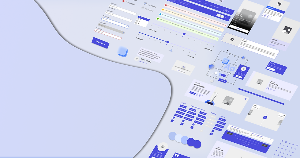
02. Component library
Our multibrand design system is a carefully constructed mosaic, where adaptable components form the foundation of a seamless, scalable framework. Using atomic design principles, we built a library of reusable elements—each a building block that transforms into cohesive patterns and templates, ensuring consistency across diverse brand landscapes.
.png)
Foundational Elements
Crafted the core foundational elements that form the backbone of the component library.

Configurable Components
Designed with mandatory and optional elements, allowing customization within standardized structures, and used Figma properties to eaily configure components
.png)
Streamlined Forms
designed consistent, accessible form fields with all states defined, ensuring usability across single-step and multi-step forms through out all websites and brands.

Patterns
Created reusable patterns for HCP, patient, and unbranded sites, tailored to each audience while ensuring consistency with modular components.
.png)
Accessibility
It's central to our design system, guided by WCAG (2.1 AA) standards and the Blue Line exercise to identify and address barriers. Features like color contrast, scalable fonts, and consistent layouts ensured inclusivity.

03 Documentation
From structure to style, every component comes with its own playbook—covering from overview, anatomy, properties, functionality, rules and usage, variations, and accessibility. It's all there, so teams can build boldly and stay aligned.

Additionally included guidelines for each component, covering
-
Customization Guidelines
-
Clear boundaries for customization with instructions to maintain consistency and adapt components to brand needs.
-
Documentation of mandatory and optional elements within the component to enable customization while preserving its structure.
-
-
Color & Contrast Standards
-
Defined color usage and contrast requirements to meet accessibility (WCAG 2.2 AA) standards.
-
-
Version Control & Updates
-
A robust system for tracking changes, version history.
-
Inhouse Team:First/Approved Release{website_name(Includes Theme)}_{INH_Handover}_{MAT_Code}
Ex: BigPharma_INH_Handover_MAT-DRM-00101
BigPharma_Theme_INH_Handover_MAT-DRM-00101
Stakeholder/AOR:Version 1 {website_name(Includes Theme)}_{AOR_Ver_1.0}_{MAT_Code}
Ex: BigPharma_AOR_Ver_1.0_MAT-DRM-00101
BigPharma_Theme_AOR_Ver_1.0_MAT-DRM-00101
04 Theme file
We built a centralized style guide — a master control panel where designers can effortlessly fine-tune typography, color palettes, and branding elements to match their brand’s identity. With a single click, these changes ripple across designs like a symphony in perfect harmony, ensuring seamless adaptation without disrupting the system’s integrity.

With this system, designers can easily theme their work to reflect brand identity—no hacks, no detours, just seamless control.
Add paragraph text. Click “Edit Text” to update the font, size and more. To change and reuse text themes, go to Site Styles.
We built a centralized style guide — a master control panel where designers can effortlessly fine-tune typography, color palettes, and branding elements to match their brand’s identity. With a single click, these changes ripple across designs like a symphony in perfect harmony, ensuring seamless adaptation without disrupting the system’s integrity.
04 Theme file
05 Responsive design optimization
Harnessing the power of Figma variables felt like unlocking a magic portal—one that transforms our designs effortlessly across the three viewports with a single click. It's like having a shape-shifting canvas, where the design seamlessly adapts to any screen size instantly.This empowered designers to effortlessly shift perspectives across viewports, enabling them to refine and perfect their designs with precision.

We pioneered the use of Figma string variables, which not only enhanced responsiveness but also enabled adaptive layouts for complex components—setting a new standard in dynamic design workflows.
.png)
Developer handoff
The handoff began by sharing foundational design tokens, typography, and grids as the blueprint, then delivered components batch wise first followed by core components like buttons and inputs to build the system’s basics. Interactive patterns such as modals and forms were introduced next, bringing functionality to life.
Conducted workshops with engineering to align Figma specs with reusable code logic, Collaborated daily with front-end developers to co-develop responsive UI kits
A feedback loop and versioning process ensured the system evolved smoothly, enabling seamless implementation.
Usability testing
-
Pilot Testing: Testing the Waters
Launched with two smaller brands, like dipping a toe into the stream, to validate adaptability and reveal potential challenges in real-world scenarios.
-
Iterative Feedback Loops: Sharpening the Blade
Engaged in continuous exchanges with designers and developers, honing templates and documentation to perfection through their insights.
-
Sandbox Validation: Crafting in a Safe HavenTested components in controlled environments alongside developers and agency partners to ensure functionality and seamless integration before wider rollout. Collaborated with QA and compliance teams to validate each component against required standards.

Pre-Development Review Process image
Onboarding and design process
-
Documentation Creation:
Designed Comprehensive guide to navigate the library and how to go through the documentation and explained about the new process. -
Training Sessions: Building the Map:
Led onboarding for 7 external agency partners, ensuring correct and consistent implementation of the design system. Conducted multi-level training sessions for AOR teams, including live demos on using components and applying brand themes—empowering them to adopt and implement the system effectively -
Pre-Development Reviews:
Introduced a review process as a safety net, ensuring designs adhered to guidelines and components were used accurately before handing them off to developers.
Results and ROI of the Multi-brand Design System
The design system resulted in tangible and measurable benefits for the company
Key Outcomes:
-
Efficiency Gains:
• Reduced design time by 40% due to reusable components and tokens.
• Faster onboarding of new brands and teams, reducing time-to-market. -
Cost Savings:
• Eliminated redundant efforts across brands, saving on external agency costs.
• Reduced revision cycles between designers and developers. -
Improved Brand Consistency:
• Delivered a unified customer experience across all channels, -
Scalability:
• The modular nature allows for seamless integration of future brands and channels without significant overhead.
ROI for the Design System (Year 1)
-
To calculate the ROI (Return On Investment) for the design system in its first year,
we used the following formula

45%
ROI is projected in the first year from the design system, driven by major savings in time-to-market, reduced inconsistencies, and enhanced productivity across both designers and developers.
Timeline
We designed library in a batch process.
Challenges
Flexibility and Structure
Stakeholders initially resisted standardization, fearing loss of creative freedom. Iterative feedback loops helped us strike the right balance.
Cross-Team Collaboration
Integrating the design system with development workflows required close collaboration and early involvement from developers.
Learnings
Early Alignment Yields Better Results
Involving stakeholders and developers early minimized rework and ensured alignment.
Modularity Enables Flexibility
A theming mechanism ensured brand individuality without compromising system integrity.
Strong Documentation Drives Adoption
Clear, developer-friendly documentation accelerated adoption and reduced onboarding friction.
Iterative Feedback Is Crucial
Testing and iterating during pilot phases ensured a polished system for full-scale rollout.
Conclusion
This project was more than just building a design system—it was about transforming how the client approached design and branding. By introducing a unified yet flexible framework, we empowered their teams to work smarter, faster, and more cohesively. The system became a catalyst for innovation, allowing each brand to think more about patients and HCP and how they can add more value in their healthcare journey and shine individually while reinforcing the parent company’s authority and trustworthiness.